什么是sticky footer布局?
一般指手机页面中,当内容高度撑不满一屏时,页脚紧贴屏幕底部;当内容高度超过一屏时,页脚紧随其后。
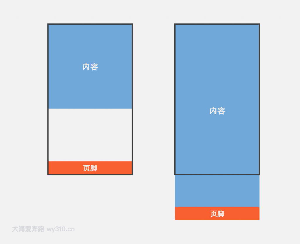
方法一:flex弹性盒子布局
- 父容器container的display为flex,并规定项目排列顺序是纵向的
- content元素的flex为1,即有多余空间就增大
- footer定义一个高度
查看演示请狠狠地点击:flex弹性盒子布局实现sticky footer
<div class="container">
  <div class="content">内容</div>
  <div class="footer">页脚</div>
</div>
body {
margin: 0;
}
.container {
display: flex;
flex-direction: column;
min-height: 100vh;
}
.content {
flex: 1;
/*非必须*/
width: 100%;
height: 300px;
line-height: 300px;
text-align: center;
color: #fff;
font-size: 30px;
font-weight: bold;
background-color: #71a8da;
/*非必须*/
}
.footer {
height: 60px;
/*非必须*/
width: 100%;
line-height: 60px;
text-align: center;
color: #fff;
font-size: 30px;
font-weight: bold;
background-color: #f85f2f;
/*非必须*/
}方法二:padding-bottom+负margin-top
- 容器wrapper需要指定min-height为100vh(vh:视窗高度)
- 内容写在content容器里,指定padding-bottom为footer容器的高度
- footer指定高度和margin-top,并且margin-top为高度的负值
查看演示请狠狠地点击:padding-bottom+负margin-top实现sticky footer
<div class="wrapper">
  <div class="content">内容</div>
</div>
<div class="footer">页脚</div>
body {
margin: 0;
}
.wrapper {
width: 100%;
min-height: 100vh;
}
.content {
/*padding-bottom应等于footer的高度*/
padding-bottom: 60px;
/*非必须*/
width: 100%;
height: 400px;
line-height: 400px;
text-align: center;
color: #fff;
font-size: 30px;
font-weight: bold;
background-color: #71a8da;
/*非必须*/
}
.footer {
/*margin-top应等于footer高度的负值*/
margin-top: -60px;
height: 60px;
/*非必须*/
width: 100%;
line-height: 60px;
text-align: center;
color: #fff;
font-size: 30px;
font-weight: bold;
background-color: #f85f2f;
/*非必须*/
}提示:两个/*非必须*/之间的部分不是实现sticky footer布局的必要代码,只是一些辅助样式,可以删除
1+
0 条评论